Sequential F&G

Rationale
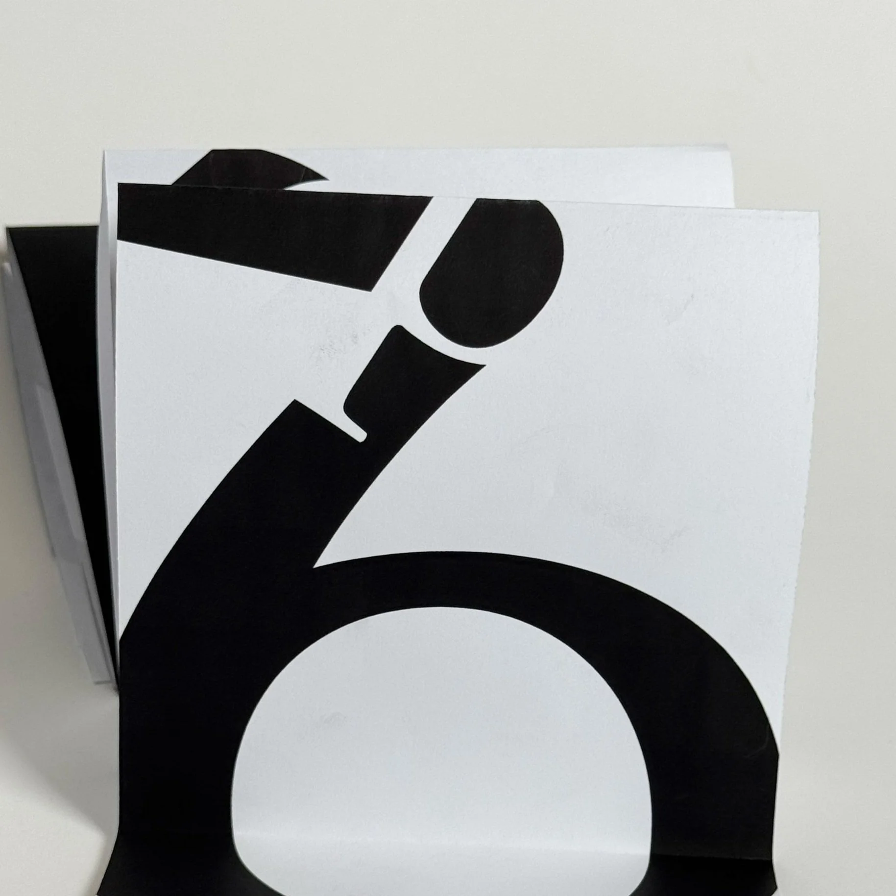
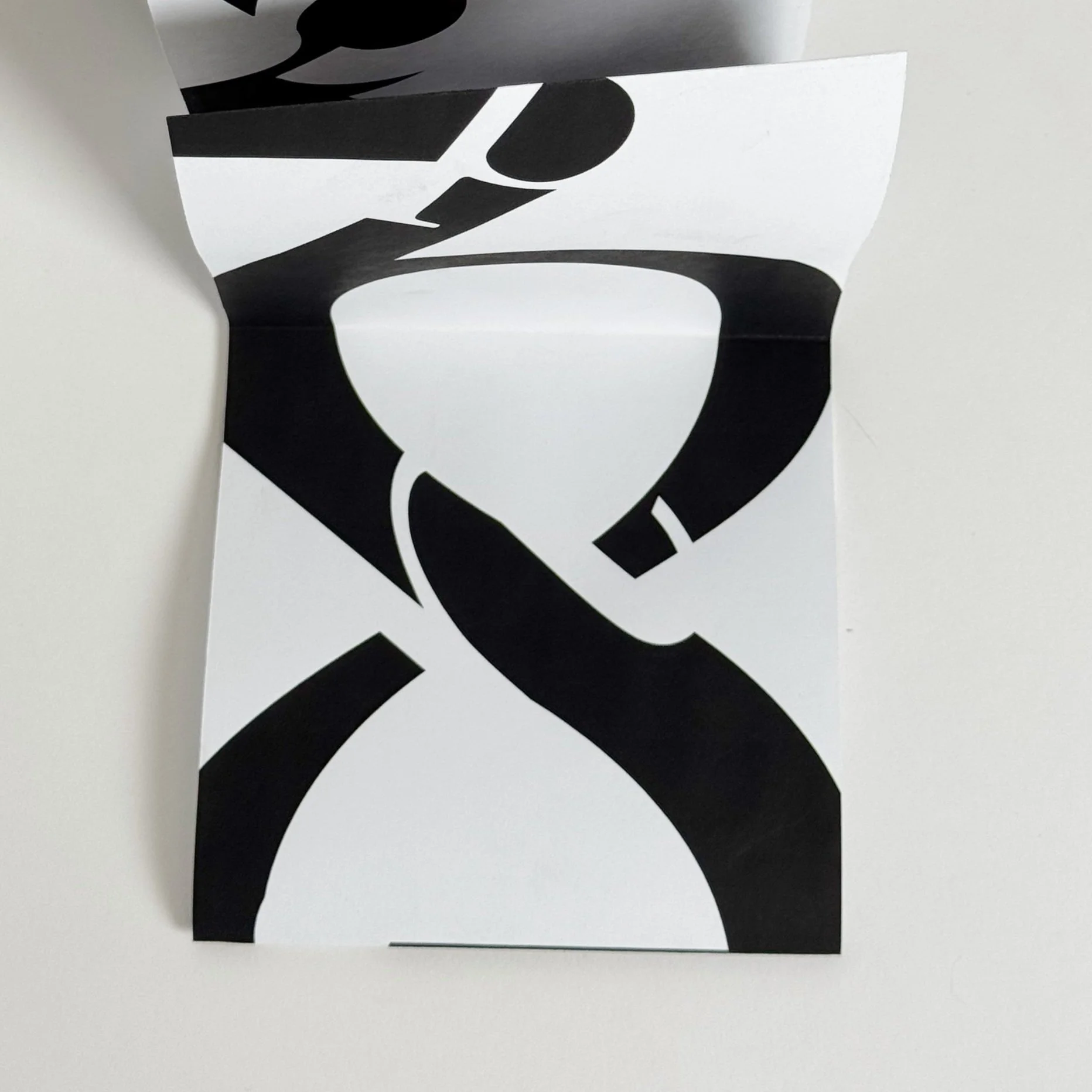
The 5 by 50 inch composition consists of the vertical descent of the word “typography” and the numbers 0-9, creating a visual exploration of Gestalt principles as well as figure and ground. Throughout the composition, there are visual queues, such as negative space leading off the page, that signal the eye to follow the entire composition all the way through. This concept balances the composition out as a whole, while the contrasting scale of letterforms and numbers balances out each individual 5 by 5 inch square. The idea of balance is further justified through the variation of typefaces in scale and design. Where there is a large-scale bold sans serif, there is a smaller serif letterform nearby in order to create a dynamic relationship between each letter. This concept applies to a large serif and a small sans serif throughout the design as well.
-
![]()
T0
-
![]()
Y1
-
![]()
P2
-
![]()
O3
-
![]()
G4
-
![]()
R5
-
![]()
A6
-
![]()
P7
-
![]()
H8
-
![]()
Y9


Flow
Demonstrating how shapes can flow into one another.

Rhythmic Pattern
Using contrasting typefaces to express rythm in a sequence.

Shape
Exploring letterform shape through a variety of typefaces.


